Art and Architecture

Gerrold on Gehry

From a Facebook post by David Gerrold, science-fiction writer of some note and resident of Los Angeles:

If there is one architect I dislike more than Frank Lloyd Wright, it is Frank Gehry, the designer of the Walt Disney Concert Hall and other curlicued atrocities.

The man doesn’t care about how his buildings will fit into the space, how they will relate to their surroundings — which is why the concave mirrors on the Disney Hall had to be toned down because they were focusing the sun’s rays on surrounding buildings and causing serious heating problems.

His buildings make no sense to the eye. They’re like a dropped pile of saucepan covers. And once inside the Disney Hall, it’s a beautiful maze. It’s too easy to get lost and forget which exit will get you to where you parked your car. You can’t find the exit and you always come out on the wrong side of the maze.

The first priority of a concert all is to have great sound. After that you design around that space.

A building should be more than a monument to the architect.

The jibe at Frank Lloyd Wright aside — I quite like Wright’s work myself, although I recognize that a place like Fallingwater is very impractical for the way most people actually live — Gerrold perfectly articulates my own feelings about Gehry. His work offends me in some deep, admittedly irrational way. I’m so glad that Gehry project proposed for just a few miles down the road from my house appears to have fallen through…

spacer

Local Landmark Is Kunstler’s Eyesore of the Month!

I make no claim to knowing anything about architecture as an art or a science, but I know what I like. And more importantly, what I don’t like. Guess which category this falls into?

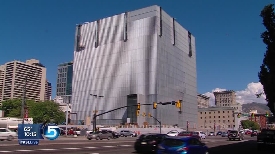
federal-courthouse-slcThat’s the new U.S. federal courthouse in Salt Lake City. Completed just about one year ago, the building houses 10 courtrooms along with associated offices and agencies, is LEED certified as a “green” building, and has won a number of awards from architectural and engineering organizations. It’s designed to make use of natural daylight as much as possible, it’s built with recycled materials, and it even has an open-to-the-public cafe in the lobby. Oh, and free Wi-Fi in the cafe, too.

Too bad it’s so frakkin’ hideous.

What the architects describe as “a primary form, projecting grounded dignity, immovable order, and an equal face to all sides” looks like an aggressively uninviting aluminum box to we lesser beings who do not dwell in the rarefied air of the modernists and post-modernists. I pass this monolith on my daily train commute every day, and I’ve heard out-of-towners and locals alike say things along the lines of, “what the hell is that?!” as it heaves into view. I’ve never heard anyone say, “Oh, I really like how its austere exterior challenges my bourgeois sense of aesthetics with its defiant lack of traditional ornamentation!” Certainly nobody has ever called it “pretty” within my hearing. What we Salt Lakers mostly call it is “the Borg Cube.”

Given my feelings about this monstrosity — which, by the way, were not at all influenced by the demolition of one of my favorite watering-holes from my younger days, the late, lamented Port o’ Call, to make room for this thing — I couldn’t help but laugh when I heard that James Howard Kunstler, author of The Geography of Nowhere: The Rise and Decline of America’s Man-made Landscape, has chosen it as his February Eyesore of the Month. Describing the architects’ sterile conceptual rendering, Kunstler says:

[Architects Thomas Phifer and Partners have] really caught that old security state spirit in a building that looks uncannily like the computer server that contains your credit record, your tax filings, your phone log, your internet purchase trail, the drone photos taken outside your girlfriend’s bedroom window, and all the other nifty data-crumbs that the world’s greatest democracy is harvesting in order to maximally coerce you. Note, they didn’t even bother to airbrush in the theoretical pedestrians but opted to show the street in its actual glorious entropic deadness.

And that in a nutshell is the problem I have with so much modernist architecture (or would this sort of thing be post-modernist? Hell, does it matter, since the last distinctive form that had any real appeal to regular people was Googie?): It often seems to be designed in a vacuum where the context of the surrounding structures don’t matter, and human beings don’t exist. The architects can describe their ivory-tower thematic concepts with as much poetry as they muster, but the truth is, if it’s not a place human beings actually feel comfortable being in and around, it’s not a good design. But superstar architects nevertheless have a way of convincing the community that their “visions” are important or even, yes, beautiful, and anyone who doesn’t agree is simply not educated in the field. It’s a real-life case of the Emperor’s New Clothes, in my opinion…

PS It’s not part of the passage I quoted, but Kunstler’s best phrase is when he describes the Cube as “a high-art monument to techno-necrophilia.” Love it!

spacer

Some Things Go Together Like Oreos and Milk…

I ran across this fun piece of fan art the other day that I thought was worth sharing:

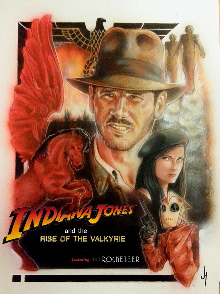
indiana-jones_rocketeer_mashup-posterThe artist is a cat named Jonathan Harris, and here’s what he has to say about this piece:

Indiana Jones and the Rise of the Valkyrie featuring the Rocketeer.
18×24 Acrylic and color pencil on Watercolor paper.


Well, the comp is pretty much done. Maybe I can make this poster size this year We’ll see.
This little art idea came about out of love and frustration.
Love for the Indiana Jones franchise and all things Indy, for the Rocketeer and the late Dave Stevens, and lastly for the incomparable talent of Drew Struzan whose posters inspired the imagination of a 9 year old boy and the continuing artistic endeavors of a 39 year old man.
Frustration over the fact that the Indy (Harrison Ford) movie franchise may be never continue, that Dave Stevens is no longer with us to give us further adventures of the Rocketeer, and that Drew Struzan is semi-retired and Hollywood doesn’t seem interested in classic movie poster production.
But in my corner of the world, imagination and heart, they will always continue. Appreciation for what has come and imagination for what might always be.

Of course, Jonathan isn’t the first to imagine a meeting between two of pop culture’s most beloved 1930s adventurers. Just sayin’.

spacer

My Latest Acquisition

flash-gordon_massacre_book

What you see up there at the top of this post is the cover of one of my favorite novels when I was around 11 or 12 years old — middle-school age. While my friends were discovering Tolkien, I was devouring pulpier, frankly trashier stuff: Edgar Rice Burroughs’ Barsoom tales, Doc Savage reprints, Alan Dean Foster movie novelizations, and anything relating to Flash Gordon, the space-adventure hero who started in a newspaper comic strip when my grandparents were still children, and who seems destined to undergo periodic revivals every couple of decades. (The latest, a misfire of a TV series, came and went in 2007.)

Massacre in the 22nd Century was the first of a series of six Flash novels that came out in 1980 and ’81. They were written by a guy named David Hagberg, although I never learned that until decades later, after the Internet came along, because his name curiously does not appear anywhere in the books themselves. While I remember them as entertaining reads, their connection to the universe originally conceived by Alex Raymond is tenuous at best. There is no Ming the Merciless in Hagberg’s books, no planet Mongo. And even though the characters at the center of this series are named Flash Gordon, Dale Arden, and Dr. Zarkov, they are significantly “off-model.” I won’t bore you with the details of how Hagberg deviates from the traditional Flash backstory; suffice it to say, I’ve long theorized that these books began as fairly generic space-opera adventures and some editor convinced him to change his protagonists’ names in an attempt to cash in on the notoriously campy Flash Gordon movie that was released around the same time. (Christopher Mills, who runs the incredible Space: 1970 blog, asserts that the Hagberg novels bear some resemblance to a Flash television series that was done in the 1950s, but I’ve never seen that version myself, so I can’t say.)

Even so, I have very fond memories of the first two books in Hagberg’s series (somehow I never got around to reading the others). And one of the things I especially loved about them was their cover art by the master illustrator Boris Vallejo. In general, I’ve always gravitated more toward the work of Frank Frazetta; his style generally has a rougher, wilder edge to it, and his fleshier women push my buttons a bit more than Vallejo’s, which seem to me a bit too smooth and perfect to be believably human. But the covers for the Hagberg books really appealed to me for some reason. I’m not ashamed to admit I spent long evenings during my adolescence closely studying the one above, lusting for Boris’ lovely red-haired take on Dale, and imagining myself as the bare-chested, noble-looking hero standing protectively behind her. It was an ideal I could never meet, of course… but even today, this image evokes so much aspirational yearning in me. It reminds me of who I wanted to be before I discovered who I actually was.

A few months ago, I stumbled across the website of Boris Vellejo and his wife Julie Bell — who is also a commercial illustrator of some note — and I learned that prints of pretty much every cover piece he ever painted are available for purchase… and Boris will even sign them for no extra charge! I’ve been babbling to The Girlfriend about this discovery ever since, certain that I wanted to get something from the site, but vacillating indecisively between the art from Massacre — which Boris incongruously titled “Future Land” — and the cover of the second book in Hagberg’s series, War of the Citadels (officially called “Flash Gordon“), of which I’m also very fond.

Well, I guess she finally grew tired of my dithering, because she took the decision out of my hands and surprised me for our 20th anniversary with this:

flash-gordon_massacre_art

She made a good call, from the choice of the print to the red matte (her pick again — I was thinking of a plain white one, myself, but in retrospect, she was right about the red making the colors in the painting pop). I absolutely adore this, and can’t wait to hang it up. Anne may not be Dale Arden, and god knows I’m a long way from anything resembling Flash Gordon… but she awakens many of the same yearnings this painting always has. I’m thankful she’s still standing with me in this strange future land in which we’ve found ourselves…


spacer

I’ve Been Pulped!

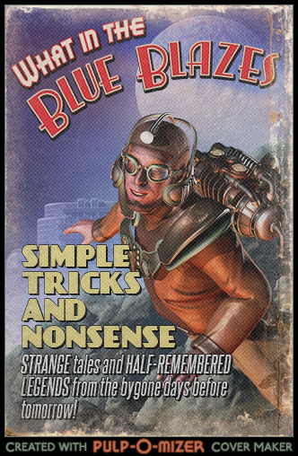
I’ve long been a fan of the “pulp aesthetic,” i.e., the general style of illustration that graced the covers of the old pulp fiction magazines that were popular through the first half of the 20th century. There were pulps for every imaginable genre — romance, westerns, war stories, detective fiction, and even sports — but, not surprisingly, the science-fiction and adventure pulps are my favorites. Their covers were sometimes lurid, and often had very little to do with the actual content of the magazine, but they stir the imagination of my inner twelve-year-old with their depictions of square-jawed heroes, fair damsels, loathsome aliens, foul villains, and horrific monsters, all set against the most fantastic of backgrounds. They’re just plain fun to look at. And of course this old pulp art was the direct forebear of the paperback novel covers I found so captivating during my formative years in the 1970s and ’80s, in particular the ones painted by Frank Frazetta and Boris Vallejo. So naturally when our colleague Jaquandor ran across a little something called the Pulp-o-Mizer — “the customizable pulp magazine cover generator” — naturally I had to try it out for myself. Here’s the cover I designed for this very blog, as if it were a feature seen in one of these old magazines:

Pulp-O-Mizer_Cover_Image

So what do you think? It’s probably no coincidence that I chose the dude with the jetpack, considering I’ve lately been reading a collection of all-new Rocketeer comics, but I think the image suits my blog anyhow. If I was a bit more clever than I am, I’d set it as the background for Simple Tricks, but alas, we’ll just have to enjoy it in the current post. Here today, gone tomorrow, I suppose.

Incidentally, if you’re intrigued by this style of art, might I recommend the excellent Pulp of the Day blog, which provides a constant stream of classic pulp covers for your artistic enjoyment? It’s been one of my daily stops for years…

spacer

I’m Such a Nerd

Here’s something that’s been going around the InterWebs the last couple days, so you may have already seen it — I’m somewhat ashamed that our esteemed colleague Jaquandor beat me to the punch on this one — but I have to make a note of it anyhow because it’s just so damn cool. It’s the latest masterpiece by artist Dusty Abell, whose tribute to the live-action Saturday-morning kid shows of the ’70s caught my eye a few years ago. But this new painting handily surpasses that earlier one, both in terms of information density — there’s a lot to look at here — and also in the size of the smile it brought to my face. Yes, I can identify each and every character, ship, and object in this painting, and tell you the name of the episode it came from… and you know what? I’m not at all shy about admitting it…

star_trek_the_original_series_by_dusty_abellBe sure to click on the image and go through to the highest magnification so you can really savor the detail. If you’re of a certain age and even a mild fan of the original — the true Star Trek, I guarantee you’ll be impressed. This image is simply magnificent. I wish Dusty was offering a print of it, to be honest…

(Also worth your consideration: Dusty’s “Television Sci-Fi  and Superheroes of the ’70s.” They’re all there, man, all my imaginary childhood friends. This Dusty Abell is my kind of nerd.)

spacer

Moving Day

I’ll be honest, the primary reason I accepted the offer of my present job seven years ago this month was simply to get some steady work after an extended period of what’s euphemistically called “underemployment.” (This is a polite term for a truly evil state of slow, grinding torture in which you’re not quite a down-and-out bum — you are working, at least from time to time — but you’ve got no long-term security, no disposable income to speak of, and a dwindling sense of self-worth. Another word for this is “contracting.” It’s not a good fit for me.)

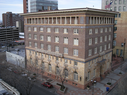
However, a second major factor in my decision was the location of my new employer’s offices, a 100-year-old, six-story building called the Commercial Club, which is situated on a quiet side street of downtown Salt Lake known as Exchange Place:
commercial-club-bldg
Exchange Place was the vision of a 19th century mining magnate, Samuel Newhouse, who wanted to establish a non-Mormon business district as a counterbalance to the LDS Church-dominated city center four blocks to the north. Described as a “little Wall Street,” Exchange was intended to be a rectangular complex anchored on its four corners by four identical office towers, all financed out of Newhouse’s own pockets. Only two of these, the twin 11-story Boston and Newhouse buildings — Salt Lake’s very first steel-framed skyscrapers — were actually constructed. Newhouse ran out of money before the other two could even break ground. But a number of ancillary buildings were completed, including the nearby Newhouse Hotel (sadly demolished in the 1980s, to be replaced by a parking lot), the Salt Lake Stock Exchange, and my home away from home for the past seven years, the Commercial Club.

Originally built as a recreational facility for the businessmen Newhouse envisioned working on Exchange Place, the Commercial Club at one time featured an indoor swimming pool; a vast, two-story banquet room; card-playing and smoking rooms for the gentlemen; and separate facilities for the ladies, primly located away from the men on their own private floor. And because Newhouse wanted the very cutting-edge in turn-of-the-century technology, the building even featured one of Salt Lake’s first mechanical elevators, which is still there and still operating — if rather creakily — today.

Of course, I didn’t know any of that when I started working there. But the atmosphere around Exchange Place was immediately and immensely appealing to me. Salt Lake isn’t like other cities I’ve visited; there’s little sense of urban life or identity here. People live out in the ‘burbs, the streets are virtually deserted after 5 or 6 PM, and most everything around downtown is relatively new and, frankly, kind of bland in appearance. But this little pocket of Salt Lake, this one block that’s bisected by Samuel Newhouse’s rebellious gentile* development, feels like a real city environment to me. It’s not quite a New York neighborhood, obviously, but it’s a place with the patina of age and the self-confidence that comes from long establishment, from rising and falling and rising again. I love the idea of a block that’s spirited enough for both thousand-dollar-an-hour attorneys and dive bars, trendy tapas restaurants and the Heavy Metal Shop.

And the Commercial Club itself fit my TV-inspired notions of what an urban, white-collar professional workplace ought to look like, with sleek modern fixtures co-mingling alongside antique decorative flourishes, just like the office sets of, say, Ally McBeal.

Admittedly, working there has had a few downsides. Multiple retrofittings have resulted in a somewhat confusing interior layout, and there have been the plumbing, heating, and insect problems common to any old building. You encounter strange smells in certain areas. That beautiful old art-deco elevator has occasionally gotten stuck between floors, sometimes with people inside (never me, fortunately). And Exchange Place can get kind of sketchy later in the evening, if you find yourself working late. (I’ve seen hookers around there after dark; there were reports of a sexual predator in the area for a while; and there was that big drug bust a few years ago when we learned the roast-chicken restaurant on the corner was a front for heroin dealers.) But generally speaking, I’ve been very comfortable in that old pile. Ancient places with colorful histories suit me.

Alas, the powers-that-be decided a while back that it’s time for a change. So starting Monday morning, I’ll be going to work in a new location… ironically enough, right smack in the middle of that Mormon city center that Samuel Newhouse was so determined to break away from. Preparations for moving 200-some employees and all their attendant stuff have been underway for some time, but it really got real last week as big orange plastic crates were delivered to each and every cubicle so we could pack up our personal effects. Most of us only made token efforts at that for the first couple days, because we needed things at hand so we could continue working. And of course everything on our agendas got put on hold following a power outage on Monday that was caused by an underground explosion. (The blast was reportedly strong enough that it lifted a couple of manhole covers several feet into the air.) But yesterday was zero hour… the moving company arrived in the afternoon, and chaos descended as people finally started dumping their belongings into those boxes. As one of my coworkers remarked to me, he felt like we were in The Empire Strikes Back during the “frantic evacuation from Hoth” scenes. Personally, I felt more like it was graduation day, a mix of bittersweet and difficult-to-articulate emotions brought on by the sense that some kind of era was closing.

As it happens, this job I thought I’d take just long enough to get back on my feet turned out to be a pretty damn good place to be. It’s lasted longer than any other job I’ve ever had, which means I’ve been working in that building for longer than any other. That’s got to generate some level of attachment, doesn’t it? Also, the Commercial Club has so much more personality than any other place in which I’ve ever worked, with the exception of the two movie theaters that will always be my favorite workplaces. Every other job on my resume’ has been in nondescript business-park type settings, and they’ve all blurred in my memory into a generically white-walled, gray-carpeted, cube-farm porridge. But the Commercial Club… ah, I’m going to miss that building. I’m going to miss the funky plaster cow-skull decorations that framed the painted blue-sky ceiling in the lobby. I’ll miss the “lava lounge” that overlooks the old two-story banquet room, which used to be a dance club back in the Awesome ’80s. I’ll miss the marble staircases with the worn-down troughs in their centers that turn so treacherous in wet weather, and the stories about a murdered prostitute who still roams the hallways at night, whispering to those who are stuck working until the wee hours. Hell, I’m even going to miss the gallows humor about cockroach crossings. I’m man enough to admit I had a bit of a lump in my throat as I walked out of there for the last time, out into a hot, dry Utah summer evening.

Our new environs will have the perk of being up high, with lots of natural sunlight and stunning views of the city around us. But a little research reveals that they were only built in 1986, too recently to have the kind of character and identity we’re walking away from. It’s been an era, all right. At least for me.

* Loyal Readers who aren’t from Utah may be confused by my use of the word “gentile” above. FYI, that’s what Mormons have traditionally called non-Mormons. Even Jews. Yes, it’s kind of weird. That’s Utah for you.

spacer

I Have a Confession

Psst. I have to tell you something. Something I’m not proud of. It’s pretty embarrassing, actually. Not “I caught herpes from the town skank” embarrassing. More in the range of “I had to take my sister to the prom because no one else would go with me.” But still, it’s bad enough…

You see, when I was younger — much younger, you understand — I went through a phase when I, um, actually kinda-sorta liked the artwork of… are ready for this? Thomas Kinkade.

Yes, that Thomas Kinkade, the self-proclaimed “Painter of Light” whose highly sentimental paintings of quaint cottages and Victorian holiday scenes and just-too-perfect landscapes have been licensed to appear on everything from Christmas-tree ornaments to calendars and greeting cards, to “collectible” plates to, I don’t know, sanitary napkins, probably. The guy who earned fortunes selling mass-produced kitsch to the QVC crowd while being utterly reviled by serious art lovers. Yeah, him.

As I said, I was young. And I had what seemed like perfectly legitimate reasons at the time. It happened just after I got back from a month-long stay in Cambridge, England, back in 1993. It had been my first time away from home on my own, the fulfillment of a wish I’d nurtured for a very long time, and I loved just about everything about the experience, and about the place. I was especially taken by the soft, fluid quality of the light over there, especially as evening approaches and the summer twilight stretches out for hours after the sun actually goes down. It was so different from the crystalline desert skies I was accustomed to back home… and it was so difficult to describe to my friends and family when I returned.

And then I stumbled across a painting that seemed to capture the qualities I remembered. I think it may have been this painting right here:

thomas-kinkade_lamplight-inn

That’s Kinkade’s “Lamplight Inn,” released in 1994 according to the info I found, so the timing coincides nicely with my return from Cambridge and period of maximum nostalgia for the place. Looking at it now, nearly 20 years down the line, I’m not quite sure why it reminded me so strongly of my beloved Cambridge, what specifically I saw there that so strongly activated my memories. But it did. The bridge was probably a factor, as there are a number of bridges on the river Cam that look like that. And the lights reflecting in the water remind me of several wonderful evenings. In any event, I decided I liked this painting’s evocative power, and I developed a brief infatuation with Kinkade’s work. I enjoyed it for exactly the reasons, I imagine, his hardcore fans do: his idealized vision of a cleaner, simpler world appealed to my desire for escape and peace. And I thought many of his paintings were simply pretty to the eye. To tell the truth, I still like a couple of them.

But as time passed, my feelings toward Kinkade started to curdle. First, I thought it was tacky when he trademarked the “Painter of Light” nickname. Then his paintings seemed to cross the line from colorful to garish, and their nostalgic tone started to feel more like calculated schmaltz. They began to strike me as cutesy, and one thing I cannot abide is cutesy. I was also repelled when he started wearing his religion on his sleeve and infusing simple subjects with overwrought symbolism. No offense to any of my readers who may actually like cutesy religious paintings, but they’re not my thing.

The biggest problem, though, was the ubiquity of his work. I’ve said before I actually tend to prefer commercial illustration to fine art, so I wasn’t bothered by Kinkade’s stuff being mass-produced, at least not in principle. But the licensing got so out of hand — this crap really was everywhere, and on everything, and it got very tiresome.

And then came the revelations that Kinkade wasn’t the good Christian he proclaimed himself to be, that he was actually fleecing the poor believers who’d bought into his franchised gallery business, and that he frequently behaved like a drunken boor… well, I decided I was done with Thomas Kinkade at that point. Now when the subject comes up, I feel like I do when I’m suffering a mild hangover: slightly ill, and vaguely ashamed of myself.

Even so, I was shocked and a bit saddened to hear that he died this past weekend at the age of 54. That’s only 12 years older than myself, way too early in my book. And once upon a time, I really did find value in at least some of his paintings. So I offer my sincere condolences to his family and to his fans…

spacer

This Is Going to Happen to Me Someday…

I just know that one of these days the amount of books inside my home is going to reach some critical mass that exceeds the structural limitations of the house itself, and then…

book-flood

(This is actually an art installation in Madrid, Spain; I’m normally not too keen on modern art “installations,” but this one amuses me. Details and more pictures — and even a video of the thing in motion, because those are actual books that blow around in the breeze — here. And I found it via Boing Boing, naturally.)

spacer

Happy Birthday, Lady Liberty!

In case you missed it, last Friday was the 125th anniversary of the dedication of the Statue of Liberty, which was, of course, a gift from the people of France to the people of the United States back in the days when Americans and French actually had some mutual respect for one another. Hard to imagine how different things must’ve been before “freedom fries” and “surrender monkeys,” isn’t it?

Now, I’m not what most people would consider “patriotic.” I don’t feel any particular emotion when I gaze upon the flag, I’ve never liked reciting the Pledge of Allegiance going all the way back to elementary school, and that damn Lee Greenwood song that’s become a Fourth of July standard makes me want to kick puppies. But my attitude about these things is not, as many would accuse, because I hate my country. Rather, I dislike the baggage that’s become attached to the usual symbols of national pride in recent decades: sticky sentimentality combined with a strain of
belligerent jingoism that’s the exact opposite of what I consider the best about America; the social pressure to genuflect to anyone in uniform regardless of whether they truly deserve the label “hero” (motivated, I’m convinced, by collective guilt over all the home-front nastiness during the Vietnam War); and the simplistic “we’re number one” mentality that makes it nearly impossible to honestly assess our nation’s shortcomings and figure out how to improve. Not to mention the way “patriotism” has become just another blunt instrument wielded by one side of the political spectrum to accuse the other of being “un-American.” It’s hard to love the flag when some blowhard who clearly loathes me for not being just like him is wrapping himself in it and calling it his and his alone.

Nevertheless, there are some places and objects that remain unsullied by that kind of ugly mudslinging, things that penetrate my shell of pinko-liberal cynicism and cause me to reflect on the history and ideals of our nation: the sprawling Civil War battlefields of Gettysburg and Antietam; the actual Star-Spangled Banner, the one notable exception to my general feelings about flags; the words of the Gettysburg Address, the Declaration of Independence, and the Constitution’s Preamble; and of course a feminine colossus whose copper skin has gone green from a century’s exposure to the weather, technically entitled “Liberty Enlightening the World,” but better known as the Statue of Liberty.

Besides her aesthetic beauty and awe-inspiring scale — really, she’s big when you’re standing at the base of her — there is all that she represents: a beacon shining through the darkness to lead the downtrodden of the world to a better place… not necessarily a better physical place, although that’s how the words on Liberty’s tablet are usually interpreted, but a better social construct in which everyone is granted equal protections under the law as well as respect and dignity and a fair chance to make a good life for themselves, no matter who they are, what they believe, who they love, or what they look like. That’s what defines my America, not the military might or material wealth or Sunday-morning piety that most people think of. It’s an ideal we don’t live up to, frankly — in my opinion, we’re actually regressing away from it at the moment — and perhaps no country can live up to that. But it’s nevertheless an ideal worth striving for. We should be grateful to the people of France for providing us with such an effective and enduring symbol of what we’re supposed to be about.

So happy birthday, Lady Liberty. May your light shine on for centuries to come, until all the people of the world have finally come in out of the cold night of injustice…

If you want to see more pics like the one above, check out this slideshow at Talking Points Memo.

spacer