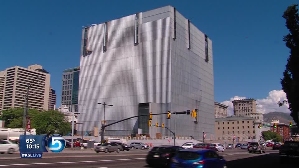
I make no claim to knowing anything about architecture as an art or a science, but I know what I like. And more importantly, what I don’t like. Guess which category this falls into?
 That’s the new U.S. federal courthouse in Salt Lake City. Completed just about one year ago, the building houses 10 courtrooms along with associated offices and agencies, is LEED certified as a “green” building, and has won a number of awards from architectural and engineering organizations. It’s designed to make use of natural daylight as much as possible, it’s built with recycled materials, and it even has an open-to-the-public cafe in the lobby. Oh, and free Wi-Fi in the cafe, too.
Too bad it’s so frakkin’ hideous.
What the architects describe as “a primary form, projecting grounded dignity, immovable order, and an equal face to all sides” looks like an aggressively uninviting aluminum box to we lesser beings who do not dwell in the rarefied air of the modernists and post-modernists. I pass this monolith on my daily train commute every day, and I’ve heard out-of-towners and locals alike say things along the lines of, “what the hell is that?!” as it heaves into view. I’ve never heard anyone say, “Oh, I really like how its austere exterior challenges my bourgeois sense of aesthetics with its defiant lack of traditional ornamentation!” Certainly nobody has ever called it “pretty” within my hearing. What we Salt Lakers mostly call it is “the Borg Cube.”
Given my feelings about this monstrosity — which, by the way, were not at all influenced by the demolition of one of my favorite watering-holes from my younger days, the late, lamented Port o’ Call, to make room for this thing — I couldn’t help but laugh when I heard that James Howard Kunstler, author of The Geography of Nowhere: The Rise and Decline of America’s Man-made Landscape, has chosen it as his February Eyesore of the Month. Describing the architects’ sterile conceptual rendering, Kunstler says:
[Architects Thomas Phifer and Partners have] really caught that old security state spirit in a building that looks uncannily like the computer server that contains your credit record, your tax filings, your phone log, your internet purchase trail, the drone photos taken outside your girlfriend’s bedroom window, and all the other nifty data-crumbs that the world’s greatest democracy is harvesting in order to maximally coerce you. Note, they didn’t even bother to airbrush in the theoretical pedestrians but opted to show the street in its actual glorious entropic deadness.
And that in a nutshell is the problem I have with so much modernist architecture (or would this sort of thing be post-modernist? Hell, does it matter, since the last distinctive form that had any real appeal to regular people was Googie?): It often seems to be designed in a vacuum where the context of the surrounding structures don’t matter, and human beings don’t exist. The architects can describe their ivory-tower thematic concepts with as much poetry as they muster, but the truth is, if it’s not a place human beings actually feel comfortable being in and around, it’s not a good design. But superstar architects nevertheless have a way of convincing the community that their “visions” are important or even, yes, beautiful, and anyone who doesn’t agree is simply not educated in the field. It’s a real-life case of the Emperor’s New Clothes, in my opinion…
PS It’s not part of the passage I quoted, but Kunstler’s best phrase is when he describes the Cube as “a high-art monument to techno-necrophilia.” Love it!


Ok, I had all these same feelings. BUT THEN I walked by it at night when it had the interior lit up, and it looks amazing in there–natural wood and graciousness. So between that and the natural light I bet it’s a really great building *for the people in it*. I have no credentials to criticize architecture but it does seem that it is serving its occupants well.
Well, I’ll concede I’ve not been inside or seen it at night… but during daylight hours… ugh.