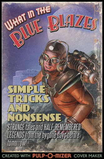
I’ve long been a fan of the “pulp aesthetic,” i.e., the general style of illustration that graced the covers of the old pulp fiction magazines that were popular through the first half of the 20th century. There were pulps for every imaginable genre — romance, westerns, war stories, detective fiction, and even sports — but, not surprisingly, the science-fiction and adventure pulps are my favorites. Their covers were sometimes lurid, and often had very little to do with the actual content of the magazine, but they stir the imagination of my inner twelve-year-old with their depictions of square-jawed heroes, fair damsels, loathsome aliens, foul villains, and horrific monsters, all set against the most fantastic of backgrounds. They’re just plain fun to look at. And of course this old pulp art was the direct forebear of the paperback novel covers I found so captivating during my formative years in the 1970s and ’80s, in particular the ones painted by Frank Frazetta and Boris Vallejo. So naturally when our colleague Jaquandor ran across a little something called the Pulp-o-Mizer — “the customizable pulp magazine cover generator” — naturally I had to try it out for myself. Here’s the cover I designed for this very blog, as if it were a feature seen in one of these old magazines:
So what do you think? It’s probably no coincidence that I chose the dude with the jetpack, considering I’ve lately been reading a collection of all-new Rocketeer comics, but I think the image suits my blog anyhow. If I was a bit more clever than I am, I’d set it as the background for Simple Tricks, but alas, we’ll just have to enjoy it in the current post. Here today, gone tomorrow, I suppose.
Incidentally, if you’re intrigued by this style of art, might I recommend the excellent Pulp of the Day blog, which provides a constant stream of classic pulp covers for your artistic enjoyment? It’s been one of my daily stops for years…


