If my Loyal Readers will recall, I didn’t hate J.J. Abrams’ 2009 reboot of the Star Trek franchise, but I wasn’t especially wild about it either. I thought it was a superficially exhilarating popcorn flick, but really pretty dumb at its core. Also, for all the ballyhoo about the way Trek 2.0 (as I like to shorthand it) created an alternate Star Trek timeline in order to free the filmmakers from the accumulated continuity of five TV series and 10 previous feature films, its plot about a vengeance-seeking madman with a doomsday weapon struck me as, well, let’s call it overly familiar. And we won’t even speak of those damn lens-flares.
Now the marketing machine is cranking up again for the first of who knows how many Trek 2.0 sequels to come, Star Trek into Darkness. (Yes, I typed that correctly. If you haven’t been keeping up with this stuff, Abrams, et. al., has dropped the franchise’s long-established naming convention, i.e., Star Trek-colon-subtitle.) The first official poster design has hit the InterWebs and I’ve just got to say… I’m not impressed.
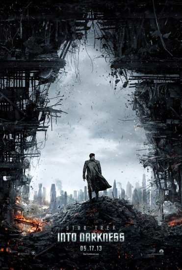 First of all, does it remind you of anything? It ought to, considering its obvious inspiration was well-nigh ubiquitous this summer:
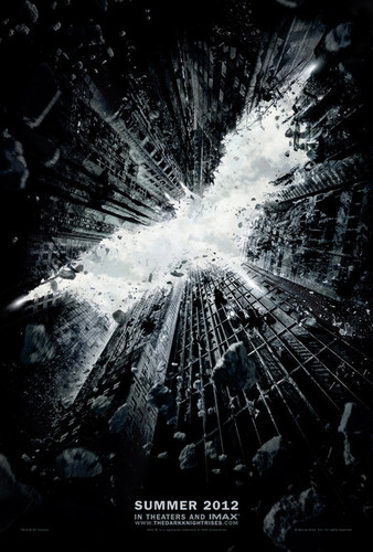 Apparently, Abrams wanted to escape from established Star Trek lore so he could rip off Batman.
Okay, that’s not fair. A poster is just marketing, after all, and I’ve been following the movie biz long enough to know there’s often a huge disconnect between the marketing and the actual film, and the writers and directors rarely have anything to say about it. Perfect example: this year’s John Carter, a fun, swashbuckling fantasy of the old-school “planetary romance” variety and, in my opinion, the first adaptation of Edgar Rice Burroughs that came anywhere near to being faithful to the source material. (All those Tarzan flicks? Yeah, not much resemblance to the literary Tarzan, for the most part.) Carter should’ve been huge, in my opinion. But the movie was doomed from the start by a half-assed ad campaign that made the uninitiated think it was a turgid, deadly serious rip-off of Attack of the Clones, and also by the studio’s curious reluctance to accurately call it what it really was: John Carter of Mars. So I acknowledge that it’s far too early for me to write off Star Trek into Darkness as something I won’t like, and pretty reactionary to do so on the basis of one poster (not to mention the title, which, for the record, I also don’t like).
Nevertheless, I’m not seeing much in this poster that says “Star Trek” to me. Whatever happened to “the final frontier” and “strange new worlds” and “going boldly?” Where’s the wonder of the human adventure? What I see here is plainly Earth — specifically London, as you can see that weird Gherkin building in the skyline; apparently, it’s still standing in the 23rd century — and it’s dystopian and apocalyptic and, frankly, pretty damn pessimistic-looking. And that ain’t Star Trek. Not to me, anyhow. I don’t know what J.J. Abrams thinks Star Trek is supposed to be about, but I have yet to see much evidence that it’s what I — and generations of my fellow Trekkies — understand it to be about.
Fortunately, I’m getting better at compartmentalizing different aspects of the far-flung, decades-old media franchises that I’ve spent so much of my life’s energies obsessing over. I seem to have finally internalized the nasty truth: that as far as their corporate owners are concerned, these things are simply brands to be extended and diversified. And just as I don’t drink every product the Coca-Cola Company slaps its brand on, I’m not required to see, read, or buy everything that includes Star Trek in its name, either.
